
So you’ve created an amazing new website for your company or a cool e-newsletter that you want to share with your loyal customers and maybe get some new ones; but there’s a problem.
You’ve noticed that you’re not getting as many people clicking through to your e-book, your web form or your videos as you would like. But the links are clearly on the front page of your website and on your e-newsletter, so what’s going on?
Well, it could be that your audience has a tough time seeing your calls-to-action. A call-to-action can be a link and/or phrase that connects two very critical pieces in lead generation: incoming traffic and the opportunities to convert these visitors into new leads. In order to drive more traffic to your website and the offers you want them to opt-in to, you need to make call-to-action improvements.
So what kind of improvements should you be making? Here’s a list of the TOP 12 Calls-to-Action that you need to drive more traffic & get more leads.
1) Calls-To-Action Using Contrasting Colors
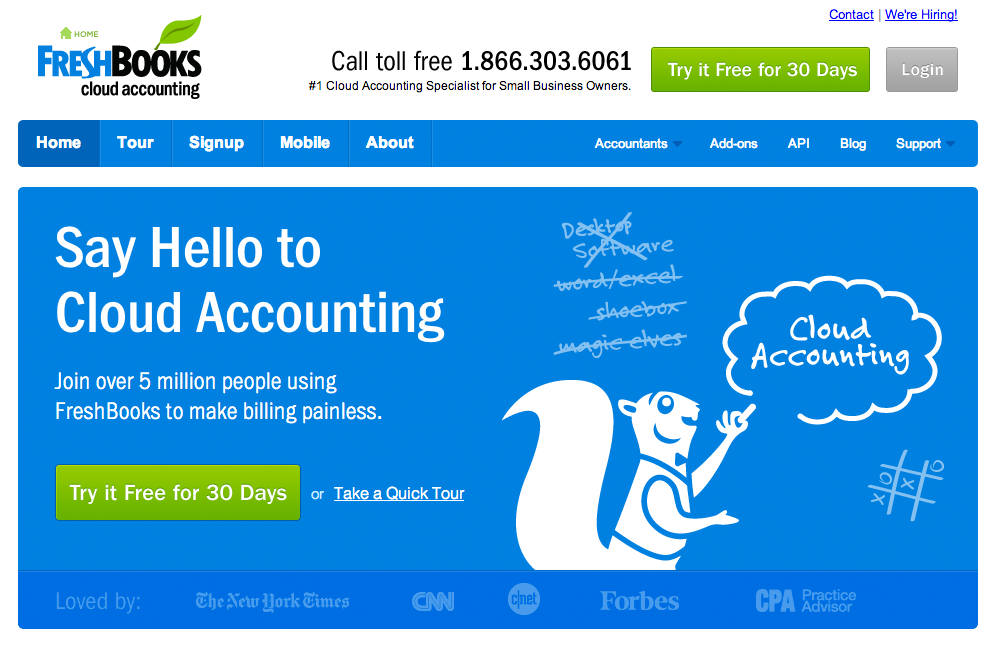
The fastest way to grab someone’s attention is by making your CTA stand out from the rest of the page by making it dominant. You can do that by choosing a color for the button or link that contrasts the background.
There’s no rule of thumb or guideline to follow about choosing colors to make your CTA stand out on the page, except THIS ONE: make sure you choose a color that works with your overall website design AND avoid patterns.
If you’re using a background on your website that has a lot of different colors and shapes, consider putting a dark semi-transparent box behind your CTA to make it readable and give it a chance to stand out. Or, use white text for your CTA on top of warm colored (such as red, yellow or orange) boxes to make it stand out.
2) Calls-To-Action Presenting An Incentive

If you place a CTA asking someone to download your whitepaper for instance, you might want to mention a bonus that goes along with it. Maybe it’s free, or there’s a discount available or even a bonus offer of a cool template or e-book to go along with it. Sometimes offering a compelling incentive with your CTA can go a long way in having visitors take the next step.
By offering exclusive discounts with your CTA, you’re allowing visitors access to a special club that allows them to experience everything you have to offer and more, easily and efficiently. What also works well is telling them that clicking on the CTA to get started will only take a minute. People respond well to taking action as long as they aren’t a long process.
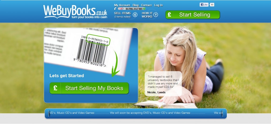
3) Calls-To-Action Showing Product

By showing your product or service with a CTA, you make the offer seem more tangible to visitors; they know exactly what they’re getting. It captures what you’re trying to say and show the value of what visitors will be getting. If it’s compelling enough, they’d click through your CTA
Having a screenshot or video of the product with the CTA gives visitors a visual connection between the two and makes the action more attainable. Placing an animation of a product allows visitors to get a feel for the product and its features themselves and take the next step.
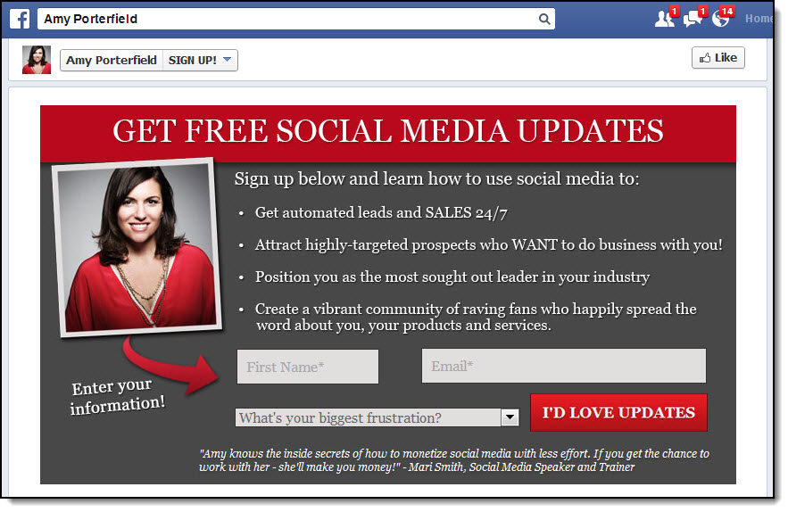
4) Calls-To-Action Using Great Text

Before you place a CTA, make sure that you have a great description in place on what sets your product/service apart from similar products. You can reinforce the message about your product in your CTA as well.
A great message can also include incentives, add clarity AND set visitors’ expectations on exactly what they’ll be getting. Adding in a teaser to entice visitors to take the next step can also be an integral part of a great message.
5) Calls-To-Action Using Spacial Effect

Don’t overcrowd your CTA with other surrounding text or images, you want to give it some space to stand out.
Separating the CTA from the rest of the content on the page means that it’s a separate item. So the rule of thumb is that if you have a tight connection between the CTA and another element on the web page, such as a great message about your product/service, then there should be less white space between them. Only keep the CTA separate from web page elements that have nothing to do with the CTA.
Make sure you have enough breathing room around a CTA to make it stand out and help the reader focus on all the important information on the page.
6) Calls-To-Action Creating a Sense of Direction
Some of the most successful CTAs have arrows pointing at them that creates a sense of direction and guides visitors to important elements on the page. This prioritizes information and creates a traffic flow on the website.
Having a CTA with an arrow that points to the right follows the natural step in terms of reading left to right, so putting that on the front page draws visitors’ eyes to the next step.
Other visual effects can also give a sense of direction such as circling the CTA with a handwritten font.
7) Calls-To-Action For Email Generation
You can also use a CTA to capture emails to build your own list of loyal customers that you’ll follow up with, notify them of discounts, promotions or special events and create your own captive audience that can become advocates for your brand and generate some amazing UGC for your marketing campaigns.
An element that can help entice visitors to enter their email addresses can be a great teaser for an event, telling them to sign up for updates on a conference. It would also help to notify visitors exactly what they’ll be receiving when they enter their email addresses, so that your company has complete transparency.
Reiterating what was said earlier about providing a great message with your CTA, don’t be afraid to add that the sign up process will be free and quick and that signing up will be hassle free and offer benefits. Also, by putting the entire sign-up process on one page, you are transparent with visitors and it makes the sign up process easier.
8) Calls-To-Action With Primary and Secondary Options

Sometimes you may have two or three competing actions you’d like visitors to do, such as sign up using their email AND download your white paper.
You can certainly have more than one CTA on a page, but you have to decide which one is most important. Make that one stand out with a more prominent placement, different color and a bigger size so that visitors can differentiate between the two.
You can turn the primary CTA into a button and just make the secondary one a hyperlink to make the primary CTA stand out.
9) Calls-To-Action Facilitating Segmentation

When you’re creating CTAs you should be thinking about the people you want clicking on them. Who are your buyer personas and what can you do to make each CTA more targeted to these audiences?
Easy! Let your community identify their own sub-personas by offering them CTAs that facilitate segmentation such as placing two CTAs on the same page but for two different groups (ie. For Students/For Teachers).
You can use bullet points to distinguish between the CTAs as well as images that convey distinct messages on what each segment identifies as.
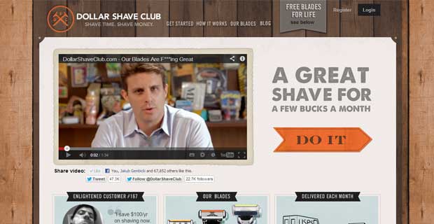
10) Calls-To-Action That Make Good Use of Video

Videos are a great format for educating visitors on certain concepts, a new product or what your company is all about and they also have the power to convey strong emotions that can prompt visitors to take action. They can be a great addition to a CTA or the video itself can BE a CTA.
You can add text encouraging people to watch the video and invite visitors to simply press ‘Play’ as a CTA.
11) Calls-To-Action With Unorthodox Shapes
Trying out fun shapes such as stars or ovals to outline your CTA with might increase the likelihood of a visitor clicking on it because it looks so different from anything else on the page. Don’t be afraid to experiment with shapes that are asymmetrical or rare.
Using unconventional shapes lets you stand out from the competition that are all using traditional shapes for their CTAs. Ribbons can also catch peoples’ attention because they convey exclusivity. Placing your CTA on the image of a Post-It Note also creates a sense of productivity and puts you in a mindset to take tasks off your list.
12) Calls-To-Action That Reduce Visitors’ Anxiety
Sometimes even though your community may be motivated enough to download your resources, you need to do some extra work to assure them that their time and energy is well-spent with you. By guaranteeing that their information and privacy is safe, you can build a much more effective and loyal relationship with visitors.
Place a note near the CTA notifying them that they don’t need to give you their credit card and put a disclaimer that states you won’t give their email addresses to anyone without prior permission. Putting in extra time and effort to calm visitors’ anxiety could bring you more leads in the long run.
Stay tuned for more marketing tips!


3 thoughts on “The Top 12 Calls-To-Action You Need for Your Marketing Campaigns”
Pingback: 16 Companies in “Boring” Industries Delivering Awesome Content | In Retrospect Writing Services
Pingback: 16 Companies In “Boring” Industries Delivering Awesome Content
Pingback: 16 Companies In “Boring” Industries Delivering Awesome Content | Curious
Comments are closed.